
Box Art
07/27/2019
Edited:
Topic:
In an age before the internet, endless, accessible reviews, or any of that, and where the scant gaming magazines were, well, scant, it was the box art adorning a game that was left to attract one’s attention, and often convince one to buy it in the first place. So sidetracked by a bout of self indulgent nostalgia, I decided to see if I could dig up all the box art I could remember and see if it still held the magic today, a long time after first hitting the shelves.
Like the Matchbox art of Roy Huxley, which for me proceeded gaming, I was always captivated by the artwork adorning boxes of many games. Unlike the work of Huxley though, game box art was for the most part second tier, probably indicative of the limited budgets of many gaming companies at the time. That does not mean it was not engaging, it was, and for a young imagination was more than enough to create an expectation of what lay beneath.
Gaming for me started with ‘micro games’, little games that cost a few dollars and usually came in a ziplock bag containing the bare essentials; with quality to match. Steve Jackson, then with Metagaming, started the legendary Ogre series this way and went on to continue it through his own ‘Steve Jackson Games’. On a rack packed full of games hanging like socks, it was the artwork that did the hard work of catching your eye and for me, already down the sci-fi rabbit hole of Foss, Moore, Elson etc., this was no mean feat. Yet they managed to pull it off…

Starfire was the very first game I’d ever bought, at a few bucks it was hard to resist. The art was not great but looking at it now, there’s something about it that has the feeling of a lot of science fiction at the time – it’s simple, unadorned but enough to get you thinking to the point that your imagination fills in the blanks. Remember, I was engrossed in what was to become the golden age of sci-fi illustration, so it’s not as if I did not have benchmarks. But there’s something about that first cover that is enough to make you think about playing the game, and in my case that was plenty.

By the time the third expansion came about, the artwork had improved dramatically and when the box set proper was released some years after, it was adorned with the crisp, graphic style of David R Deitrick, who was fast becoming a powerhouse within the genre.

Robots and Boarding Party. I’d never seen the latter before searching for these images, but it’s actually very good, especially for the period.
Robots, another title from Task Force Games became my second pocket money purchase. Unlike most other games, there were no spaceships or people in space suits involved but rather robots run amok. The cover art was unusual for this very reason and had the feeling that you were buying into a game made by the likes of Angus McKie (which you weren’t). Again, it’s simple art but there is something to it that’s intriguing enough to make you wonder…

Traveller art was as vast as the game itself. My favourite pieces though were all by Deitrick – his work just seemed more professional and more suited to the genre..
You could not call yourself a sci-fi nerd without at least having tried Game Designer’ Workshop’s Traveller, the futuristic counterpart to TSR’s D&D. Like D&D at the time, there was the wealth of art created for its universe but perhaps what is most interesting is that it’s base, or ‘corporate’ design, was super clean, sans images. Even today, those simple, well laid out covers still have a clean, classy feel about them.


Over time a bevy of artists created the look of the Traveller universe, both in the form of covers and internal art. Deitrick, for me at least, became one of the most memorable, with his work appearing both as covers and internal art. By this point, Deitrick’s style when compared to his counterparts, was almost cinematic, closer in feel to movie posters. While there was no attempt at realism in his work, it still effectively managed to set the stage for the game, without trying to make it real, or dictate to one’s imagination. In many ways, that was what made it so successful.


Steve Jackson Games’ box art style flipped flopped between fan and professional quality art (still does) but the ‘pocket box’ games for the Ogre series are still great; Deitrick’s Car Wars cover had to be included in the lineup as well… it’s still a solid piece.
Originally a ziplock bag game, the original Ogre cover by Winchell Chung depicted what was to go on and become one of gaming’s legendary designs. Printed in black/white/red it was not, and still isn’t great, almost looking like a high school textbook doodle; but it was effective, especially given the budget driven nature of the first release. By the time Steve Jackson re-released Ogre in his ‘pocket box’ formats under his own masthead, the artwork had been redone and the second instalment, GEV, was another of Detrick’s covers.
All three of the covers for the Ogre series pocket box games did a brilliant job in conveying the feeling of the game. While all three had very different styles they somehow work as a trio to excite and explain the three different game play levels they represented.


It was not until Battletech came along did box art grab me again. Granted, in Battletech’s case, there were a number of contributing factors that worked in sucking me in, but the cover of the 3rd edition rule book was, and still, is a great piece. Prior to the release of that standalone rulebook, the second edition box cover was no slouch either… though looking at it you can see why the game’s publisher, FASA, got into so much trouble with Golden Harmony, the creators of the by then famous Robotech franchise; ripping off design right down to the graphics is pretty much a no-no in anyone’s world!
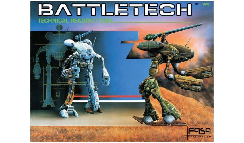
As part of the new releases at the time, was the now infamous Technical Readout: 3025 (source of much of the copyright grief), featuring new to the scene illustrator, Duane Loose. Loose joined the already well seated Deitrick, to illustrate the book and for me, it was his work that really pulled me in. Discovering the field of Industrial Design as I was at the time, Loose’s work had the crisp feeling of many automotive and product sketches I was referencing. Bold crisp lines, dynamic angles, the best of his work has that wonderful design sketch feeling to it that brings things to life without the need of colour. As an interesting side note, Loose rejoined the Battletech universe, some 25 years later, to design vehicles for the most excellent digital version of Battletech.

The art of Battletech signified, to me at least, that things were now serious in the world of gaming; the mid to late 80’s period was now professionally, as opposed to what mostly seemed ‘fan art’, driven. Interestingly though, a few years after the legal issues, Battletech seemingly became quite ‘fan art’ driven itself. Maybe because professional illustrators were weary of the lawsuit issues, or maybe the budgets were no longer there after FASA let it go but whatever it was, I personally found much of the work that followed less appealing than that of the ‘unseen’ (as it’s known) period.

The romance of this period of art though lies in the simple idea that it is unabashedly illustrative. Compared to today’s production art that strives for realism, or what I like to call, ‘illustrated realism’, box art of the early years of gaming was far more simple in its intent. It’s not that realism was not being pursued in other areas, it was, but somehow gaming very much remained in an almost story book world; which if you think about it, is far more apt for a genre often requiring you to use your imagination to create the universe as you see fit.
I’d be amiss in this piece to not mention the scant publications that were part of the gaming world at the time. I say scant as, as far as I can recall, there were only two at the time, Steve Jackson’s ‘Space Gamer’, and ‘White Dwarf’ out of the UK. Where maybe the games themselves lacked polish, the magazines did a pretty good job to help fill-in the blanks…

Space Gamer I always thought had a more purist feel to it, and in turn felt a lot more fan driven, right down to the art on the covers. As a publication, it was neither chock full of stuff, nor expensive; it was very much to the point, without any extra fluff. I liked it, still do in fact, as it feels more genuine in its intent. Looking back at the covers, you get that typical Steve Jackson Games (they produced the magazine) eclectic vibe of seemingly professional illustration mixed with fan art.

White Dwarf on the other hand was a magazine proper, chock full of all sorts of stuff about all sorts of gaming – especially D&D. I never read it but looking at the covers, you can see the serious budget and intent behind it; the covers rivalled those of Heavy Metal in the calibre of artist contributing and in fact, many of the same pieces can be found adorning both publications.

Not part of the gaming world in any way, I am including Usborne in this article simply because they are so much of the same period – I remember my first book from about ’79, predating any interest I had in gaming or sci-fi illustration by a good few years.

The Usborne collection were a curious mix of fact, fiction and speculation. Interestingly, the title ‘’Galactic War’ even had board games in it, though at the time I found them diabolical to work out. Regardless, the covers and the content within were inspiring and captivating, more so than anything I have seen available today and they probably played a large part in fuelling my interests…

Want to be in the loop? Join my newsletter


